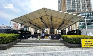
An exhibition tent can be the right size and still feel difficult to visit. The difference is usually the space between the booths. Aisles decide how people enter, where they slow down, and whether they reach the far end of the hall. This guide explains the parts of a visitor route in plain words. It shows how booth fronts and walkways work together, and lists the small layout mistakes that are easy to avoid. It is written for organisers and first-time buyers, not for engineers.
By the end, you should be able to sketch a simple plan and explain it to a supplier.
What a visitor route is made of
Think of the hall as a few simple pieces. Booths are the spaces where exhibitors show their work. A main aisle carries most of the visitors from the entrance toward the back. Smaller aisles branch off it and let people reach individual booths. The arrival area sits near the door, where people check a ticket or collect a badge.
A clear span tent helps here. Clear span means there are no support columns inside the hall, so the whole floor can be used for booths and walkways. If a column stands in the middle of a main aisle, every visitor has to walk around it. That is why organisers often ask for a column-free layout before they discuss decoration.
Draw these pieces on one sheet of paper before you talk about sizes. Mark the door, the main aisle, and the booth blocks. You do not need a scale drawing at this stage. You only need to see whether a person can walk from the entrance to the last booth without doubling back.

How wide a walkway should feel
Start with behaviour, not a number. Two visitors should be able to walk side by side. When one person stops to read a display board, another should still be able to pass. A person with a bag, a pushchair or a wheelchair should not have to wait for a gap. If your plan only works when nobody stops, the aisle is too tight.
The busy hours matter more than the average hour. A hall that feels calm at eleven in the morning can be crowded at the opening, after a talk ends, or when a popular exhibitor draws a group. Give the main aisle more room than the side aisles, and keep the widest part near the entrance where everyone arrives together.
Actual width depends on your visitor numbers, the booth layout and the rules that apply to your site. Ask the supplier to draw the plan to scale and ask your venue or local organiser which clear widths they require. Do not settle for a plan that shows only booth rectangles with the walkway left blank. A trade show tent floor plan guide can help you ask the right questions about the frame and the grid.
Give every booth a front
A booth is more than a numbered square. It needs a side that faces the aisle, so visitors can see what is on offer and step in without hunting for an opening. A corner booth has two open sides and can welcome people from two directions. A booth in the middle of a row has one open side and needs a clearer front.
Leave a little breathing room between booth fronts. If two neighbouring displays both put a screen or a table right on the aisle edge, the walkway narrows at exactly the place where people want to stop. A simple rule helps: keep tall items back from the aisle, and put the welcome point where it can be seen from a few steps away.
Walk the plan in your head as a visitor. Enter the door, follow the main aisle, turn into a side aisle, and try to reach a booth at the far corner. If that route feels awkward on paper, it will feel worse with two hundred people inside. The guide to outdoor exhibition structures explains how span and bay sizes shape the space you have to work with.

Keep arrival, queue and exit apart
The door area does three jobs at once. People arrive, people queue, and people leave. If all three happen in the same small space, the first booth inside the door gets blocked and visitors form a crowd before they see anything. Give the queue its own lane, and if you can, use a separate opening for people leaving.
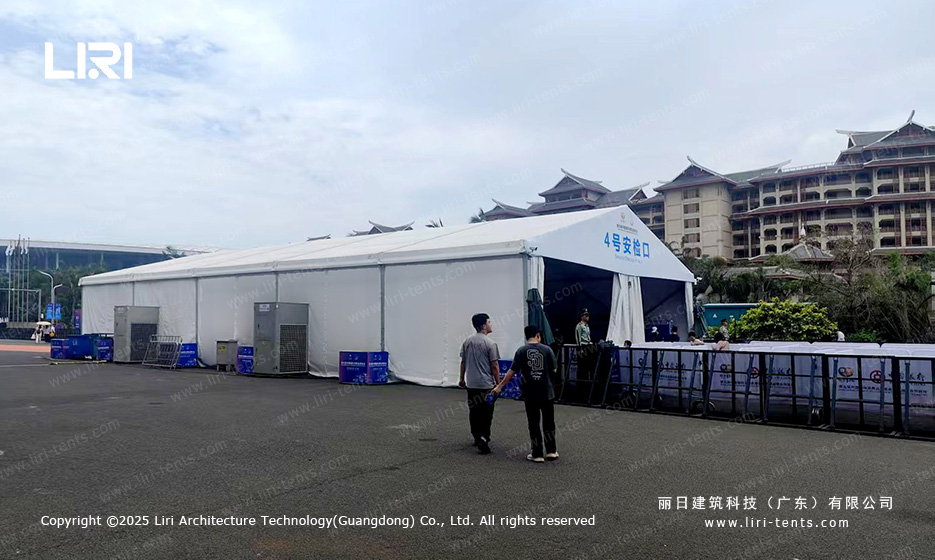
A covered entrance helps in rain and strong sun, because people slow down there to find a badge or a ticket. Put the registration table to one side of the main aisle, not across it. Keep a clear view from the door to the first aisle, so visitors understand where to go without asking staff. A simple sign at eye level does more than a printed floor plan on a wall.
Four mistakes that are easy to avoid
First, filling every square metre with booths. A plan with no spare space looks efficient on paper and feels crowded on the day. Second, putting the most popular exhibitor right beside the entrance. The crowd gathers there and blocks the door. Third, forgetting the floor. An uneven surface or a raised edge slows people down and can trip someone carrying a bag. Our page on tent wood flooring covers what lies underfoot.
Fourth, leaving cables, bins or display stands inside the walking line. These are small items, but they push visitors toward the middle of the aisle. Walk the whole route on the morning of the show, at the same height as a visitor, and move anything that sits in the way. That ten-minute check solves more problems than another round of plan revisions.
Five questions to ask before you order
First, is the hall column-free across the full booth grid? Second, where does the main aisle run, and how wide is it at the door? Third, can the arrival queue sit outside the main walking line? Fourth, what floor is included, and are the edges level? Fifth, can you see a scale plan with the booth fronts and the walkway shown together?
Those questions keep the conversation about the visitor, which is what the show is for. Once the route on paper feels easy to walk, the structure, the booths and the floor can be chosen around it. If you would like a layout for your own show, tell us the visitor numbers, the booth count and the dates, and we will put a simple plan together. You can also browse the main event tent products to see the frame types that suit a column-free hall.